40 Responses (page 1 of 2)

  1. Pro Michael Spitz Michael Spitz

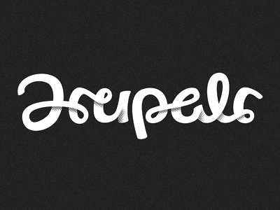
    Further exploration into the scripted logotype option...

    Again > small spelling tweak, so I had to nix the PL/AR ligature pair, which I was pretty fond of...

    In any case, lots more tweaking to do on this one, but at least we've got the spelling nailed down.

    RE the shading style > I'll see if I can carry that through one way or another... Otherwise I'll definitely find a way to sneak it in at some point ;)

    **Larger view (attached)

    likes

    over 1 year ago

  2. Marty Lavender Marty Lavender

    Am I just not using my brain today? What does it say? I loved the sneak peak you showed in an earlier post. Still loving it now.

    likes

    over 1 year ago

  3. Matt Sauter Matt Sauter

    Hot dog, that's schweet!

    likes

    over 1 year ago

  4. Us and Them Us and Them

    Love it.

    likes

    over 1 year ago

  5. Pro Michael Spitz Michael Spitz

    @big design - Ha! That might present a bit of an issue... (Edited Title) This was my first stylized notion playing with the typography. But ultimately we might end up with something a bit simpler... Thanks a lot.

    @Matt / Us & Them - Cheers guys!

    over 1 year ago

  6. Pro Jared Granger Jared Granger

    Loving the style but the D & R's are hard to make out. I first though the d&r was combined to make an H, then I saw the d as an A (like the aesics A). Diggin the direction but I think the letterforms are going to need to some tweaking for readability though. Keep up the great work bud!

    likes

    over 1 year ago

  7. Pro Jonathan Ogden Jonathan Ogden

    I love the type! Although it reads 'Hupelr' to me.

    likes

    over 1 year ago

  8. Marty Lavender Marty Lavender

    @Michael Whats funny is I saw the update that you liked my message and when I looked I realized the title answered my question...little did I know you had just edited the title :P

    likes

    over 1 year ago

  9. Pro John Williams John Williams

    I like the halftone shadow. It’s a bit hard to read the letterforms though

    likes

    over 1 year ago

  10. Pro Michael Spitz Michael Spitz

    @Jared / Jonathan - Thanks guys > still working on resolving the 'D' clearly... Wanted to keep it flowing in a similar style, but I'll obviously have to define it a bit more to avoid confusion...

    Admittedly, at this point I don't always read it clearly myself... ;)

    over 1 year ago

  11. Pro Nick Slater Nick Slater

    Oh come on mike! Why you have to be such a show off!!! :D I think you like making people jealous and drool over how sick this piece it is!!! Love it!

    likes

    over 1 year ago

  12. Pro Joel Glovier Joel Glovier

    Yeah I can't read it either (after I tried real hard *without looking at the shot title, too* I got "hupals"), but it is maybe the best take on 3d/2d lettering I've seen. I heart the halftone.

    likes

    over 1 year ago

  13. Pro Ced Funches Ced Funches

    I got Hupals as well but dope regardless.

    likes

    over 1 year ago

  14. Viktor Engborg Viktor Engborg

    Having a hard time reading what it actually says, but dang, it's stunning.

    likes

    over 1 year ago

  15. wb reaves wb reaves

    really nice

    likes

    over 1 year ago

  16. Pro Alen Type08 Pavlovic Alen Type08 Pavlovic

    I read it as Hupalc... That sounds Slovenian a bit, so I thought it had to be that way :)

    likes

    over 1 year ago

  17. Brad Blackman Brad Blackman

    It is hard to read. Nice, though.

    likes

    over 1 year ago

  18. Pro Sean Ferguson Sean Ferguson

    Man, are you really supposed to be enjoying yourself this much? I better call the police because you're having all the fun with this. You funhog!

    The halftones are really coming together nicely.

    likes

    over 1 year ago

  19. Pro Nemanja Jovanovic aka Fracturize Nemanja Jovanovic aka Frac...

    love it man! but tbh it reads as Hupels to me

    likes

    over 1 year ago

  20. Megan Kirby Megan Kirby

    Gorgeous!

    likes

    over 1 year ago

  21. Pro Breanne Merrick Breanne Merrick

    Love it but I thought it said "Hupalr" as well. Some more tweeking and it will be perfectly gorgeous!

    likes

    over 1 year ago

  22. Pro Alex Pankratov Alex Pankratov

    As beautiful as it is, it is also completely illegible. -up- is the only part that is more-or-less unambiguous, the rest though is very tricky to read.

    likes

    over 1 year ago

  23. Pro Michael Spitz Michael Spitz

    Thanks a lot for the feedback guys!

    Think we'll just have to classify this particular version as 'pretty / unreadable'.

    Still working with it for sure...we'll get there ;)

    likes

    over 1 year ago

  24. Pro Steve Lowtwait Steve Lowtwait

    Heck, I find the word hard to read in Helvetica as the shot title. I'm not joking. It's a very awkward set of letters. One thing I think you've done well is breaking the flow between the u and the p. It helps it phonetically.

    Now just keep tweaking until the letters are clear individually. I look forward to the next iteration.

    likes

    over 1 year ago

  25. Pro Michael Spitz Michael Spitz

    @Steve - HA! I hear that. Bit of a handful, I'll admit... But again, we'll get there eventually. Cheers buddy!

    over 1 year ago

keyboard shortcuts: previous shot next shot L or F like