Find designers
Designer search
Quickly find your next designer
Post a job
The #1 job board for design talent
Inspiration
Courses
UX Diploma
Learn UX design from scratch in 6 months
UI Certificate
12-week UI skill building for designers
Live interactive workshops
with design professionals
Jobs
Go Pro
Log in
Dribbble: the community for graphic design
Log in
Sign up
Wepay Checkout
Marco Sousa
Follow
Following
Like
#F5F5F5
#B1CECB
#ACACAC
#616161
#B1D304
#70A24D
#076E98
#193337
Download color palette
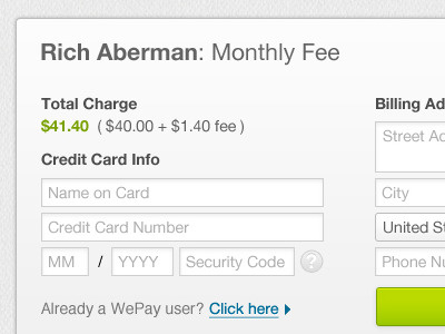
Cool to work on a layout with tiny space for a checkout form for
WePay
charge
checkout
credit card
form
iframe
input
payment
total
ui
ux
wepay
View all tags
Posted on Sep 14, 2011
4,958
11
34
2
View feedback
Marco Sousa
More by Marco Sousa
View profile
Previous
Next
Loading…