iPad App concept two

13 Responses

  1. Pro Oykun Oykun

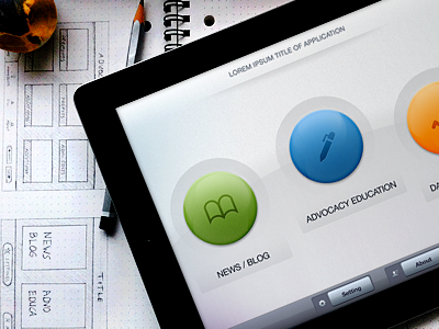
    Here is the approved concept two. Client didn't want to have any photo, instead, big buttons with company brand colors in a clean concept with bright colors...

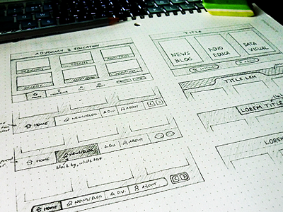
    Attached is the closer look for detail hunters.

    Ps, it is still in process...
    Comments are much appreciated.

    Thanks,

    --------

    ps, This is just welcome screen, sub screens will have more elements with richer UI.

    over 1 year ago

  2. Steven Grant Steven Grant

    wow - the buttons actually look 3D, good job my man.

    likes

    over 1 year ago

  3. Pro Oykun Oykun

    @Steven: Thanks :) actually I wasn't allowed to use much light effects and 3D look depth since client didnt want too shinny stuff. but I still used some in limits :) that buttons could be so much more 3D look...

    over 1 year ago

  4. Pro Zane David Zane David

    Looks great!

    likes

    over 1 year ago

  5. Rubén Hidalgo Rubén Hidalgo

    Clean and detailed. Good job!

    likes

    over 1 year ago

  6. Pro Oykun Oykun

    @Zane @Ruben : Thanks guys :) this project has very limited time-scale, I hate to rush projects, but sometimes we have to... still doing my best to focus in details.

    over 1 year ago

  7. Pro Bryce Bryce

    Love the simplicity!

    likes

    over 1 year ago

  8. Pro Gert van Duinen Gert van Duinen

    Very cool man, dig it.

    likes

    over 1 year ago

  9. Pro Oykun Oykun

    @Bryce @Gert Thanks guys :)

    over 1 year ago

  10. ☺ aLper ☺ ☺ aLper ☺

    Nice job Oykun

    likes

    over 1 year ago

  11. Pro Jérôme Montagne Jérôme Montagne

    Light, clean and colorful. Love this.

    likes

    over 1 year ago

  12. Pro Oykun Oykun

    Thanks for the love guys :)

    over 1 year ago

  13. Kostya Antonenko Kostya Antonenko

    nothing special, but looks really great! love this!

    over 1 year ago

keyboard shortcuts: previous shot next shot L or F like