Find designers
Designer search
Quickly find your next designer
Post a job
The #1 job board for design talent
Inspiration
Courses
UX Diploma
Learn UX design from scratch in 6 months
UI Certificate
12-week UI skill building for designers
Live interactive workshops
with design professionals
Jobs
Go Pro
Log in
Dribbble: the community for graphic design
Advance your career with a Professional Diploma in UX Design
Learn more
Log in
Sign up
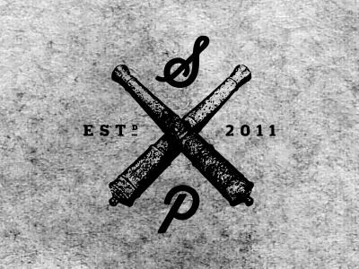
S & P
Jay Fletcher
Available for work
Follow
Following
Like
Get in touch
#A7A7A7
#CECECE
#6C6C6C
#080808
Download color palette
bw
cannon
distressed
View all tags
Posted on Sep 13, 2011
3,919
7
64
8
View feedback
Jay Fletcher
Graphic design & illustration in Charleston, SC since 2001.
Get in touch
More by Jay Fletcher
View profile
Previous
Next
Loading…
Loading…
Loading…