Rock Couture Logo Design

After sleeping on the first idea, I felt it lacked the 'finesse' and 'style' that we are looking to marry up with the rock and gothic vibe. It was only the first idea, so have spent 12hrs solid - looking at variations.
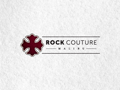
This idea came in around the 11hr 50min mark. :) It feels more like a fashion label, so am happier with this direction. This format could be easily applied to a strip of fabric, to run alongside the neck for example. But hopefully doesn't limit itself to just a label, should look equally respectable on a letterhead etc.
Main change being the typeface, this is much more elegant, hints more at 'fashion and style' and has a neutrality to it.
Also changed the logomark', to give the screen version a bit more depth. The client and I have yet to discuss colours, so this is by no means fixed, and could just end up being black.


