Find designers
Designer search
Quickly find your next designer
Post a job
The #1 job board for design talent
Inspiration
Courses
UX Diploma
Learn UX design from scratch in 6 months
UI Certificate
12-week UI skill building for designers
Live interactive workshops
with design professionals
Jobs
Go Pro
Log in
Dribbble: the community for graphic design
Log in
Sign up
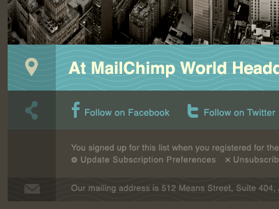
wavy
Veerle Pieters
Available for work
Follow
Following
Like
Get in touch
#47433B
#29261F
#62A7AA
#79BDC1
#868075
#D2D9C0
Download color palette
brown
cream
email
helvetica
icons
mailchimp
minimal
newsletter
teal
waves
yellow
View all tags
Posted on Jun 10, 2010
17,222
19
217
21
View feedback
Veerle Pieters
Welcome to my design portfolio on Dribbble
Get in touch
More by Veerle Pieters
View profile
Previous
Next
Loading…
Loading…
Loading…