Find designers
Designer search
Quickly find your next designer
Post a job
The #1 job board for design talent
Inspiration
Courses
UX Diploma
Learn UX design from scratch in 6 months
UI Certificate
12-week UI skill building for designers
Live interactive workshops
with design professionals
Jobs
Go Pro
Log in
Dribbble: the community for graphic design
Advance your career with a Professional Diploma in UX Design
Learn more
Log in
Sign up
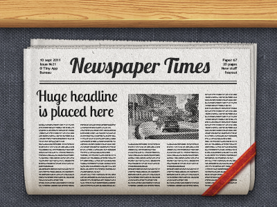
Newspaper icon
Vladimir Fer
Follow
Following
Like
#E1DFDB
#525357
#CFA366
#2A2B2F
#A8A49E
#C9C1B4
#9D5F3F
Download color palette
Newspaper icon for an upcoming app. What do you think guys?
app
icon
ios
ipad
iphone
View all tags
Posted on Sep 9, 2011
6,041
11
129
6
View feedback
Vladimir Fer
Industrial designer
More by Vladimir Fer
View profile
Previous
Next
Loading…