Find designers
Designer search
Quickly find your next designer
Post a job
The #1 job board for design talent
Inspiration
Courses
UX Diploma
Learn UX design from scratch in 6 months
UI Certificate
12-week UI skill building for designers
Live interactive workshops
with design professionals
Jobs
Go Pro
Log in
Dribbble: the community for graphic design
Log in
Sign up
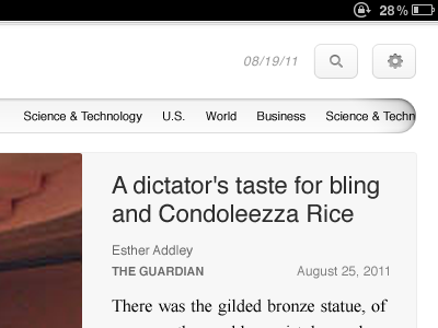
Ongo iPad interface
Morgan Allan Knutson
Available for work
Follow
Following
Like
Get in touch
#F8F8F8
#0C0B0B
#562F2A
#A0A0A0
#88483B
#5E5E5E
Download color palette
Working on a new direction for the Ongo iPad app. Pretty stoked about it.
design
interface
ios
ui
ux
View all tags
Posted on Sep 9, 2011
4,743
9
103
10
View feedback
Morgan Allan Knutson
Get in touch
More by Morgan Allan Knutson
View profile
Previous
Next
Loading…
Loading…
Loading…