However, the contrast between Register and Sign In is a bit off, what is the action at hand, Sign In right? Then that button should be more important than Register. Also, try using Username & Password (remove the 'here', that's like saying 'click this link →' )
This form has two buttons. Every form should have a singular finish. I love the style, but this is where you'd do well to read through something like Luke Wroblewski's book on forms http://rosenfeldmedia.com/books/webforms/
10 Responses
Pro
Haziq Mir
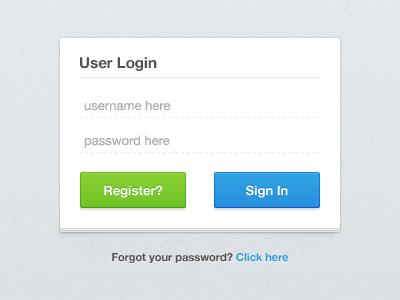
A very clean login UI I might code :)
Feedback is welcome :)
Now Available for download here - http://bit.ly/q858yX
9 months ago
Pro
Jari Sanders
Try a adding little more contrast, Awesome! I'm proud of you ;-)
9 months ago
Pro
Haziq Mir
@Jari
Thanks, will try that :)
I'll never forget you! ;)
9 months ago
Pro
Yummygum
I like the minimalism.
However, the contrast between Register and Sign In is a bit off, what is the action at hand, Sign In right? Then that button should be more important than Register. Also, try using Username & Password (remove the 'here', that's like saying 'click this link →' )
;-)
9 months ago
Pro
Haziq Mir
@Yummygum
Thanks!
Totally agree with both the points. That's why I added the '?' to the register button. However, will find a better way to get the messsage across :)
9 months ago
Pro
Matthew Smith
This form has two buttons. Every form should have a singular finish. I love the style, but this is where you'd do well to read through something like Luke Wroblewski's book on forms http://rosenfeldmedia.com/books/webforms/
9 months ago
Rebound
Clean Login: Improved
by Haziq Mir
Considered the points you guys said. What say now? :)
Now Available for download here - http://bit.ly/q858yX
9 months ago
Pro
Haziq Mir
@Matthew
Completely agreed :) Will have to check that book after my exams ;) Thanks! Check the rebound :)
9 months ago
Pro
Plat4M
Very clean. Beautiful.
6 months ago
Pro
Haziq Mir
- Plat4M
Thanks :)
6 months ago