Find designers
Designer search
Quickly find your next designer
Post a job
The #1 job board for design talent
Inspiration
Courses
UX Diploma
Learn UX design from scratch in 6 months
UI Certificate
12-week UI skill building for designers
Live interactive workshops
with design professionals
Jobs
Go Pro
Log in
Dribbble: the community for graphic design
Log in
Sign up
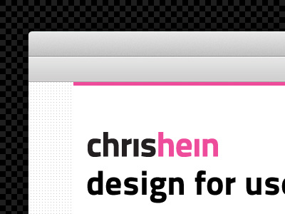
Chris Hein Top Bar
Christopher Hein
Follow
Following
Like
#F3F3F3
#0E0E0E
#A5A4A4
#403C3D
#EE4E9C
#F6A5CD
Download color palette
chrishein
logo
pattern
pink
tagline
View all tags
Posted on Sep 8, 2011
593
0
5
3
View feedback
Christopher Hein
More by Christopher Hein
View profile
Previous
Next
Loading…