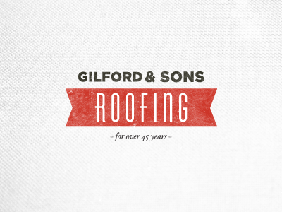
Gilford & Sons Logo *Final

Here is the final draft of the Gilford and Sons logo. I really wanted to capture the family owned history of the company. I worked to give the illusion that the shape was a roof.
Hope you like!
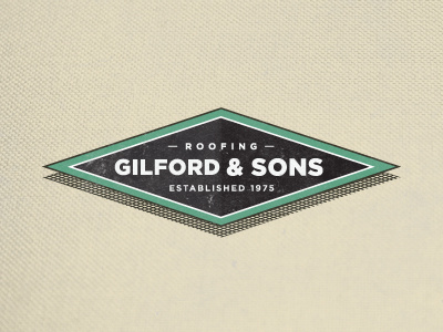
Here is another concept I was working on. Click here!!!