Let's have a ride


In a flat UI, indicating what elements are interactive can be tricky. Our goal is always to design highly usable and enjoyable digital experience. Let's share our thinking...
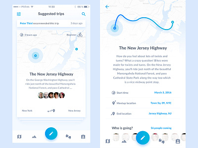
With flat interfaces color is always a key component of visual design. The majority of this layout is white, so our goal is to give all interactive and important elements contrasting color. Lot of the screens are primarily text-driven, so we are trying to help user with simple iconography. We were also working with conventional placement. One of the samples could be the small back arrow icon placed in the upper-left corner, where users would expect to find it. While we are working on the transitions and interactions we are always keeping in mind that the right interaction or technology is the one that best meets the user’s needs, and not merely the newest or most exciting.


