Find designers
Designer search
Quickly find your next designer
Post a job
The #1 job board for design talent
Inspiration
Courses
UX Diploma
Learn UX design from scratch in 6 months
UI Certificate
12-week UI skill building for designers
Live interactive workshops
with design professionals
Jobs
Go Pro
Log in
Dribbble: the community for graphic design
Advance your career with a Professional Diploma in UX Design
Learn more
Log in
Sign up
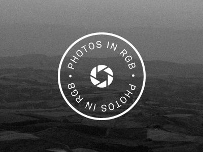
Photos in RGB
Ole Martin Kristiansen
Follow
Following
Like
#252525
#636363
#8B8B8B
#F7F7F7
Download color palette
A new symbol/logo for my
photo blog
. It's not necessarily the final, so feedback is much welcomed.
blog
identity
logo
photography
View all tags
Posted on Sep 5, 2011
2,067
4
59
6
View feedback
Ole Martin Kristiansen
More by Ole Martin Kristiansen
View profile
Previous
Next
Loading…