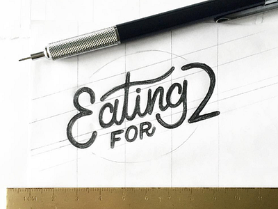
Eating For Two?


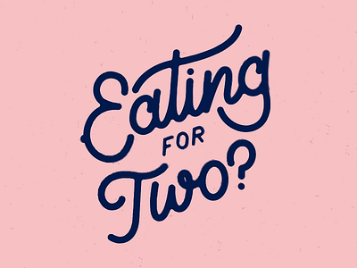
I changed this from the initial sketch after some awesome feedback. Now there's a subtle hint of a baby bump on the E. I've chosen a dark shade of navy blue which looks good against pastel pink, blue and yellow, which are the other brand colours.
It feels really good to work some lettering again.