Infographic Timeline

Shot

1 Attachment

13 Responses

  1. Daniel Bent  Daniel Bent 

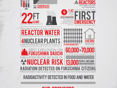
    This is an infographic timeline Im working on. It was for the Tsunami and Earthquake that happened in Japan. Inspired by: http://www.digitalsurgeons.com/japan-earthquake-tsunami-infographic/

    likes

    almost 2 years ago

  2. Nick Slater Nick Slater

    Hell yeah!!!

    almost 2 years ago

  3. Lim Seng Jueh Lim Seng Jueh

    Wow.

    almost 2 years ago

  4. buatoom buatoom

    very interesting

    likes

    almost 2 years ago

  5. Drew Hoffman Drew Hoffman

    looking good.

    almost 2 years ago

  6. Joel Alan Keightley Joel Alan Keightley

    Great work man I did something similar a few months back! http://www.flickr.com/photos/mricono/5692620411/sizes/l/in/photostream/

    almost 2 years ago

  7. Daniel Bent  Daniel Bent 

    @Joel Alan Keightley Nice!. I really like the grid style.

    almost 2 years ago

  8. Chris Edington Chris Edington

    Looks familiar... haha... glad to see you put it up man... I loved this when you showed it in class

    almost 2 years ago

  9. Amanda Mocci Amanda Mocci

    Great work Daniel!

    almost 2 years ago

  10. Matt Pringle Matt Pringle

    likes

    over 1 year ago

  11. Pete Sena Pete Sena

    Great work Daniel off to a nice start for sure. I'd suggest giving your content areas some "breathing" room right now they all sorta blend together so it makes the visual hierarchy of content a bit hard to follow. A great example of breaking up statistics into logical content relationships can be found here http://www.doobybrain.com/2010/02/26/the-anatomy-of-an-infographic/

    Try to think of the various information blocks you are trying to convey and support them into "buckets" right now while I feel you have a nice palette and the start of typography down you are trying to accomplish a ton in similar areas and it all sort of runs together.

    A nice example of typography running together I found here http://www.crazyonesquote.com/ but the information tells a story and you can easily flow and read from part to part. Since you have many visual elements, graphs, icons, glyphs, etc you might want to consider how you segment these into "areas"

    One thing i would suggest though is to watch how similar you gravitate to others work. The typography, color and stylistic nature of your piece reminds me a great deal of something our team did for Japan here http://www.digitalsurgeons.com/japan-earthquake-tsunami-infographic/

    Keep up the great work and please do share updates if you do any!

    likes

    over 1 year ago

  12. Daniel Bent  Daniel Bent 

    Thanks for all the feedback. Yes, I started this as a re-design because I wanted to get into making infographics. Also, yes I was very inspired by this piece: http://www.digitalsurgeons.com/japan-earthquake-tsunami-infographic/ . This was just a school project/test and I also cited that website when I submitted It to my instructor. I also agree with you on the clutter. After some months looking at it, I really strayed away from liking it.

    over 1 year ago

  13. Finn Harries Finn Harries

    WOAH!

    over 1 year ago

keyboard shortcuts: previous shot next shot L or F like