CrossFit City Line
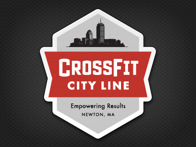
This is the logo I preferred, but the client wanted to go in a different direction with the typography. I also really liked the shape of this lockup; I thought it was unique and ownable. And it would’ve made a great sticker : )
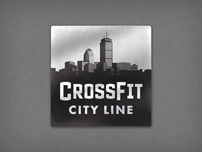
This is the logo I preferred, but the client wanted to go in a different direction with the typography. I also really liked the shape of this lockup; I thought it was unique and ownable. And it would’ve made a great sticker : )


