Pandora player experimental

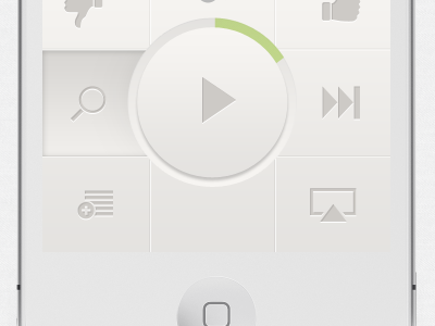

I love Pandora, I do. Such a great service, they changed the way people listen to music. However, I think the current Pandora iPhone app needs many improvements. They're probably working on one anyway, but this is my take on a pandora like music player. Mainly I don't think you need a full screen album art, why do I need to see that? Why can't I bookmark, search, add a new station with one tap? Anyway so I started this out as a Pandora redesign, then moved towards the colors I like. This is still work in progress. Anyway, this was a quick experiment that I can't wait to finish.
Feedback is much appreciated as always.


