Find designers
Designer search
Quickly find your next designer
Post a job
The #1 job board for design talent
Inspiration
Courses
UX Diploma
Learn UX design from scratch in 6 months
UI Certificate
12-week UI skill building for designers
Live interactive workshops
with design professionals
Jobs
Go Pro
Log in
Dribbble: the community for graphic design
Advance your career with a Professional Diploma in UX Design
Learn more
Log in
Sign up
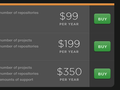
Choose a product
Ole Martin Kristiansen
Follow
Following
Like
#515151
#292929
#459B4A
#979797
#DD8F43
#D4E2D5
#2B662D
#C77726
Download color palette
More from the Gitorious product page design.
button
gitorious
View all tags
Posted on Jun 8, 2010
1,902
3
37
8
View feedback
Ole Martin Kristiansen
More by Ole Martin Kristiansen
View profile
Previous
Next
Loading…