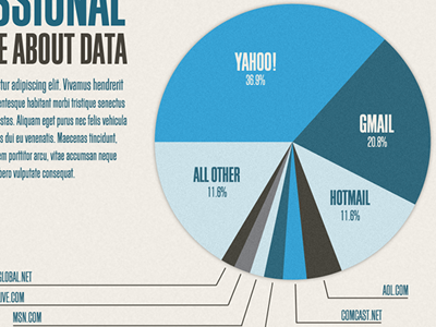
Working on a big info graphic about email services by education and profession. The kids love these things.