Screen_shot_2011-09-02_at_15.02.59

17 Responses

  1. Jonno Riekwel Jonno Riekwel

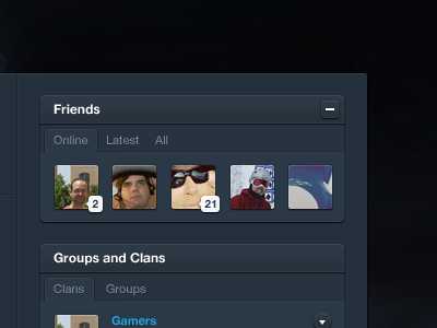
    Designing a web app is fun. Designing a web app for gamers is something else. Tough job. But fun.

    likes

    almost 2 years ago

  2. Russell Bishop Russell Bishop

    I really, really, really like this. I want to use it nao!

    almost 2 years ago

  3. Julie Ng Julie Ng

    Like the colors and depth but not sure how I feel about tabs, esp. when there is a header like element above it.

    What about trying to remove the tab and the corresponding horizontal line and just giving the word some darker background color with rounded corners when it's selected?

    Just a thought for comparison.

    likes

    almost 2 years ago

  4. CJ Melegrito CJ Melegrito

    I don't like the font smoothing with the subheadings. Especially with 'online'. Other than that, lovin' the colour scheme and subtle details!

    almost 2 years ago

  5. Joshua Sortino Joshua Sortino

    The highlights on the avatars are crisp!

    almost 2 years ago

  6. Jonno Riekwel Jonno Riekwel

    Obviously the font is rendered by Photoshop.

    likes

    almost 2 years ago

  7. Pranav Pranav

    The colors used in this are really great Jonno!
    But I see a broken inner shadow on the 'online' and 'clans' tab : http://cl.ly/3v301k0H3M3F1h2w073V

    likes

    almost 2 years ago

  8. Jonno Riekwel Jonno Riekwel

    Good spot Pranav!

    almost 2 years ago

  9. Gert van Duinen Gert van Duinen

    Neat~!

    almost 2 years ago

  10. Drew Wilson Drew Wilson

    looking good man!

    almost 2 years ago

  11. Brett Nyquist Brett Nyquist

    Really like the softness of it. Nice work man!

    almost 2 years ago

  12. Rogie Rogie

    Maybe just be, but the overall contrast of text/bg and tab/bg seems too low.

    likes

    almost 2 years ago

  13. Mikael Eidenberg Mikael Eidenberg

    Looks very nice and crisp.

    Small things that I think can be improved.

    http://bit.ly/rfPQnd

    The gradient break could have just a little more contrast, looks like banding right now.

    the top highlight is darker then the right, on the top bar and [-] its not like that, that maybe solves one of the contrast issues too.

    almost 2 years ago

  14. Ignacio Giri Ignacio Giri

    I would use icons or some sort of dropdown with filters instead of tabs. Tabs are boring.

    almost 2 years ago

  15. Plot Plot

    Nicely done, Jono!

    almost 2 years ago

  16. Stefan Nitzsche Stefan Nitzsche

    Nice, but where is the contrast? ;)

    almost 2 years ago

  17. Bri Bri

    your making us all look bad!

    almost 2 years ago

keyboard shortcuts: previous shot next shot L or F like