User Activity Card

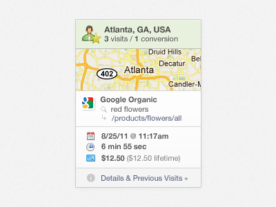
Rather than a standard table for viewing/filtering user activity, we're trying this idea of user "cards". We can show a lot of data in a small amount of space and when drilling down for details, a larger card is shown in a Lightbox-style overlay. (Icons from the amazing Fugue set)


