Drew-avatar

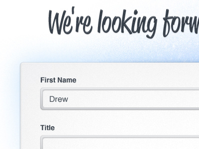
This is a Contact Form

Formz

10 Responses

  1. Pro Drew-avatar Drew Wilson

    This is one of the contact forms for the upcoming Advise.me website! :)

    9 months ago

  2. Photo Andrew Firstenberger

    Dig the font.

    9 months ago

  3. Pro Drew-avatar Drew Wilson

    Me too :) Font is: Reklame

    likes

    9 months ago

  4. Op-1 Jesse Dodds

    Nice work Drew :) One thing though; the border radius' are mismatched so the width of the stroke seems to balloon out on the corners. Always try to make sure the inner radius = outer radius minus the width between for nice looking corners.

    Edit: Just threw this together so you could see the difference :) http://cl.ly/3A2P1n072A1J2k0f2E0z

    likes

    9 months ago

  5. Pro Drew-avatar Drew Wilson

    Good tip Jesse James!

    9 months ago

  6. Pro Photo Simon Raczka

    "Jesse James" LOL

    9 months ago

  7. Pro Drew-avatar Drew Wilson

    Thanks @Jesse ... though your's is mathematically correct.. i think i like the roundedness of mine .. even though i think i might shave off 2px of the roundedness.. to me urs looks square.. which wasn't the feel i wanted.
    But again.. i agree.. urs is the more realistic way :)

    9 months ago

  8. Pro For dr Eric Hoffman

    Looking good!

    9 months ago

  9. Pro Rocket-64x64 Alex Pankratov

    I would certainly make the input boxes' background brighter, almost white.

    9 months ago

  10. Pro Transparant_bubble_avatar Yummygum

    Really digging the noise on that blue bg. Font is awesome, we used it on Icon Shelf too.

    9 months ago

keyboard shortcuts: previous shot next shot L or F like