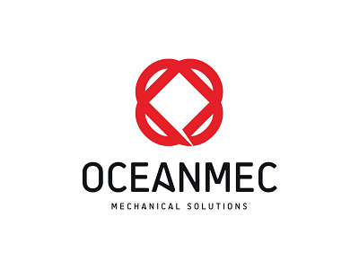
Oceanmec Logo
The logo is formed as two combined “O” letters and while square in the centre is represents the machine, half roundings on the outside are emphasises robustness of the machine.
When the symbol viewed from a simple aspect it resembles an atom which symbolises energy and the notch opened from the inside out expresses the energy generated by the machine.
Posted on
Feb 19, 2016
More by POPUPSMART View profile
Like


