Rewards UI

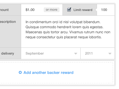

Explored a UI & interaction for rewards in the project build process. This one begins to feel a little cramped for space and has a lot of lines going on. How would you improve it?
Explored a UI & interaction for rewards in the project build process. This one begins to feel a little cramped for space and has a lot of lines going on. How would you improve it?


