Logo See Run Do

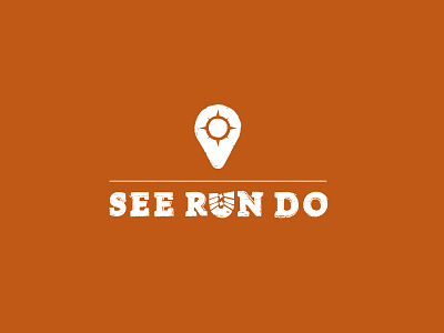
This logo was designed for a travel website that is going live later this month. The clients wanted a logo that was both minimalistic and robust. They loved to see some subtle/smart references to the elements 'see', 'run' and 'do' ...and it had all to be done with a tight budget.
So I had to be creative. After some research and sketching I came up with the boot print as a substitute for the 'U' character. Its style and robustness set the tone for the rest of the logo. The addition of the 'pin' is a bit cliché, but it balances the visual appearance of the logo, adds an easy recognizable element and -this last point was very important to the clients- could function as an actual 'pin' to mark locations on maps.


