Find designers
Designer search
Quickly find your next designer
Post a job
The #1 job board for design talent
Inspiration
Courses
UX Diploma
Learn UX design from scratch in 6 months
UI Certificate
12-week UI skill building for designers
Live interactive workshops
with design professionals
Jobs
Go Pro
Log in
Dribbble: the community for graphic design
Log in
Sign up
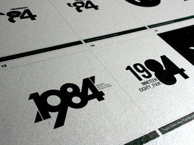
1984 Logo Options
Sean Ball
Follow
Following
Like
#A1A49F
#D6D9D6
#C2C3BD
#030604
#585F5B
Download color palette
Logo designs for 1984 Studios, a little local studio run by my friend Mat Miller.
1984
branding
film
identity
logo
photography
studio
View all tags
Posted on Aug 30, 2011
6,861
34
260
19
View feedback
Sean Ball
More by Sean Ball
View profile
Previous
Next
Loading…