Find designers
Designer search
Quickly find your next designer
Post a job
The #1 job board for design talent
Inspiration
Courses
UX Diploma
Learn UX design from scratch in 6 months
UI Certificate
12-week UI skill building for designers
Live interactive workshops
with design professionals
Jobs
Go Pro
Log in
Dribbble: the community for graphic design
Log in
Sign up
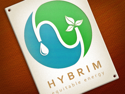
Hybrim
David Ogden
Follow
Following
Like
#F0EDE3
#6C2204
#8C3607
#30A1B2
#54BE56
#BBB49F
#AE9863
#6A4837
Download color palette
Playing with a logo design concept for an alternative energy r&d lab.
blue
branding
energy
green
identity
logo
View all tags
Posted on Aug 29, 2011
630
0
10
5
View feedback
David Ogden
More by David Ogden
View profile
Previous
Next
Loading…