


Online business card

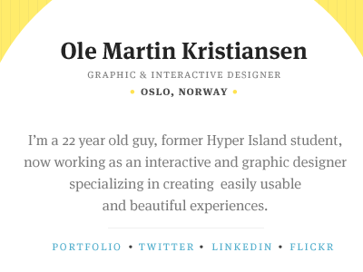
Spent a few hours this Sunday designing and coding an online business card for myself. Live version.
PS: The live version is still work in progress :)
Spent a few hours this Sunday designing and coding an online business card for myself. Live version.
PS: The live version is still work in progress :)


