This is the second iteration of a blog design I've been working on, specifically the date-tab. I abandoned the hard-edged container (seen in the original shot) in favor of something that doesn't segment the browser window so much. To keep some depth I added a light directional gradient under the tab. Also new to this version, the number of comments made on a post appears as part of the tab.
I'm not confident the date is being handled in the best way possible so any advice/comments would be appreciated. Thanks much!
7 Responses
Pro
Chuck Borowicz
My first shot! Thanks to Regina Casaleggio for drafting me. I hope to slam many a dunk :^)
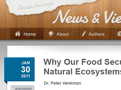
This is a design in-progress for a conservation group's blog – icons by YummyGum.
9 months ago
Pro
Caleb Royce Lummer
every element in this is done so well. bravo, chuck.
9 months ago
Very clean. Cool!
9 months ago
Pro
Regina Casaleggio
Welcome to Dribbble. Like this.
9 months ago
Pro
Andrew Korytsev
Wow! Very clean! Love it!
9 months ago
Pro
Chuck Borowicz
Thanks for all the feedback and likes everyone! Very happy to be dribbbling. Regina, thanks again so much. You. Are. Awesome.
9 months ago
Rebound
News & Views Rebound
by Chuck Borowicz
This is the second iteration of a blog design I've been working on, specifically the date-tab. I abandoned the hard-edged container (seen in the original shot) in favor of something that doesn't segment the browser window so much. To keep some depth I added a light directional gradient under the tab. Also new to this version, the number of comments made on a post appears as part of the tab.
I'm not confident the date is being handled in the best way possible so any advice/comments would be appreciated. Thanks much!
9 months ago