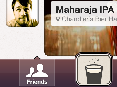
Really nice improvements! The tab bar is much better in this version. Two thoughts: (1) the beer button is clearly a button in the affordance sense, but it doesn't quite entice me to press it. I think it has something to do with the texture and relatively flat dimensionality (2) if you interpret the friends glyph to be you and a friend then the Chandler glyph makes sense, but if someone interprets the friends glyph to be two of your friends it might be weird to see the same friend used to represent yourself.
Looks great, Chandler! Quick thought: Maybe increase the size of the hands (and bottle/pint) on the "Friends" icon? The seem a bit small to my eye. Otherwise, looking fantastic.
I agree with everyone Chandler, definite positive improvements. Looking at it on my iPhone, the texture in the top menu bar gets pretty lost if I didn't know to look for it. Maybe increase it's opacity, or the opacity of the gradient on the bar to pull more depth in?
Also, only on the iPhone, something about the beer button and it's proximity to the edge of the screen feels a little uncomfortable. I don't know that this is the solution, but i tried getting rid of the bottom radius to let the button be more stable/ not in conflict with the phone. http://cl.ly/1X1k0v2D2o0H3G1L3k0r
Duuude! I like the friends icon a lot more now. A lot more character and less "standard" silhouette cutout. Keep pushing! This is looking better and better!
16 Responses
Pro
Chandler Van De Water
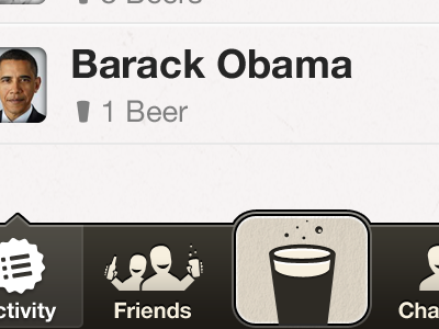
Color changes, some texture refinements, new icons, etc. The new icons are in the right direction but I'm no Rogie, so...
This also gives a view of the friends page. See the two attachements & try to view them on your iPhone.
And yes, I forgot to update the "selected" state in the tab bar for the friends page. Please give me some specifics of what I can improve here.
over 1 year ago
Pro
Joel Beukelman
Hly Crap dood. I want this now. #GoodWork
over 1 year ago
Pro
Dave Rupert
These icons are so much better! They give it a character where it otherwise was hurting.
The brownish color is way better than the purple. More tavern like.
over 1 year ago
Pro
Kevin Smith
Loving the progress!
What do the friends look like with eyes? More or less creepy than they do now?
over 1 year ago
Pro
Brian Benitez
Nice work Chan-diggity.
over 1 year ago
Pro
Tyssul
Great improvement. Love the colors and icons
over 1 year ago
Pro
Galen Gidman
Much better, but I think the people need eyes.
over 1 year ago
Pro
Justin Belcher
Really nice improvements! The tab bar is much better in this version. Two thoughts: (1) the beer button is clearly a button in the affordance sense, but it doesn't quite entice me to press it. I think it has something to do with the texture and relatively flat dimensionality (2) if you interpret the friends glyph to be you and a friend then the Chandler glyph makes sense, but if someone interprets the friends glyph to be two of your friends it might be weird to see the same friend used to represent yourself.
over 1 year ago
Pro
Jory Raphael
Looks great, Chandler! Quick thought: Maybe increase the size of the hands (and bottle/pint) on the "Friends" icon? The seem a bit small to my eye. Otherwise, looking fantastic.
over 1 year ago
I agree with everyone Chandler, definite positive improvements. Looking at it on my iPhone, the texture in the top menu bar gets pretty lost if I didn't know to look for it. Maybe increase it's opacity, or the opacity of the gradient on the bar to pull more depth in?
Also, only on the iPhone, something about the beer button and it's proximity to the edge of the screen feels a little uncomfortable. I don't know that this is the solution, but i tried getting rid of the bottom radius to let the button be more stable/ not in conflict with the phone. http://cl.ly/1X1k0v2D2o0H3G1L3k0r
over 1 year ago
Pro
Chandler Van De Water
Thanks guys, good ideas. @Ethan, I tried that as well but for some reason I just don't love it. I'm still not sold either way, so we shall see.
over 1 year ago
Pro
Dave Keller
Duuude! I like the friends icon a lot more now. A lot more character and less "standard" silhouette cutout. Keep pushing! This is looking better and better!
over 1 year ago
Pro
Adam Tolman
That friends icon is glorious. Nicely done.
over 1 year ago
Pro
Tim Van Damme
Much much better.
over 1 year ago
Rebound
Tavern v2.1
by Chandler Van De Water
New beer button, new (flat) button styles & other improvements. More feedback, dear friends!
over 1 year ago
Pro
Brian Potstra
I'd love to have a beer with Obama. The app is nice too ;)
over 1 year ago