Hey Regina, love the color palette. Feels like a good start. I'm not digging the transition from the light blue background to white - the smoothness of the triangles with the dots underneath. I think if you clean that part up and match the size of those triangles with the top of the video container, that may help it hang together more. Feels like you've got a few too many different elements (fonts, dot treatments, etc...) and it may help to repeat a few of them to bring the page together.
Maybe give the ribbon a hard left edge. Seems like it might need that sense or strength. I might also present some sort of separation or icon to show they are feature points not a nav (unless they are navs). GREAT DESIGN.
Regina, I am tracking with you now... somewhat at a loss for an answer myself. I do sense the disconnect between the main copy and the call to actions... don't have any good answers tho...
maybe take a nap and let your subconscience work it out : )
I like what you have so far.
On the left side I would play more with the the ribbon you have below the main text. You have said it's not navigation, but it may look like navigation, so you must avoid that possible confusion. Also I would separate the 3 elements in a better way, since now at the first second look like it's just one long text, so it may add more confusion. Maybe you can play with the orange a bit in that section, since now all is blue and may look bland (only a small tweak of orange there maybe can do it look better)
Another version of the header - attachment has little more context.
Although this one feels a bit heavier that the pervious one - I think it works better. Comments and suggestions welcome.
17 Responses
Pro
Regina Casaleggio
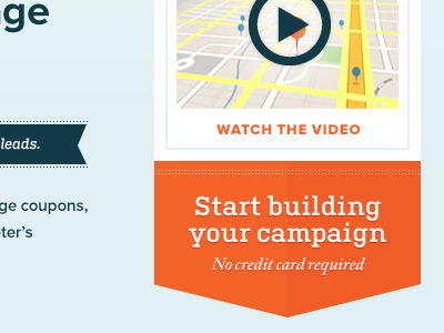
Designed almost 20 versions of this header today - something doesn't feel right - wanna help out? :(
9 months ago
Pro
Harry Ford
I like everything I can see so far, lovely colouring.
9 months ago
Regina, what do you feel its lacking? What were you aiming for?
The dots might be something to explore...
9 months ago
Pro
♫ ♬ ♪ Wendell Fernandes ♪ ♬ ♫
Maybe a bit more of a footer information?
9 months ago
Hey Regina, love the color palette. Feels like a good start. I'm not digging the transition from the light blue background to white - the smoothness of the triangles with the dots underneath. I think if you clean that part up and match the size of those triangles with the top of the video container, that may help it hang together more. Feels like you've got a few too many different elements (fonts, dot treatments, etc...) and it may help to repeat a few of them to bring the page together.
9 months ago
Pro
Regina Casaleggio
Thanks Harry :)
Matthew: It's the left side - feels like it's lacking something - it's a lot of copy to work with - looks bland, so blue...
9 months ago
What if you made the ribbon into more of a 3 icon illustration? As is, looks a bit like a navigation menu.
9 months ago
Pro
Regina Casaleggio
Thanks Josh - will take your comments into consideration. I actually had the ribbon as icons. Will explore that option again.
9 months ago
Pro
Regina Casaleggio
Hi Wendell - no it's a little out of context - here is a bit of the rest of the site: http://dribbble.com/shots/244064-PinPointsocial-Pricing/attachments/7275
9 months ago
Pro
Trav
I actually like it a lot as is!
9 months ago
Pro
Scott Perket
Maybe give the ribbon a hard left edge. Seems like it might need that sense or strength. I might also present some sort of separation or icon to show they are feature points not a nav (unless they are navs). GREAT DESIGN.
9 months ago
Pro
Regina Casaleggio
Thanks Travis - probably been staring at the thing for too long.
9 months ago
Pro
Regina Casaleggio
Thanks Scott - Josh mentioned the same thing; it's not a nav. The hard left edge is a great idea.
9 months ago
Regina, I am tracking with you now... somewhat at a loss for an answer myself. I do sense the disconnect between the main copy and the call to actions... don't have any good answers tho...
maybe take a nap and let your subconscience work it out : )
good luck!
9 months ago
Pro
Ricardo Salazar
I like what you have so far.
On the left side I would play more with the the ribbon you have below the main text. You have said it's not navigation, but it may look like navigation, so you must avoid that possible confusion. Also I would separate the 3 elements in a better way, since now at the first second look like it's just one long text, so it may add more confusion. Maybe you can play with the orange a bit in that section, since now all is blue and may look bland (only a small tweak of orange there maybe can do it look better)
9 months ago
wow this is amazing...
9 months ago
Rebound
Header Button
by Regina Casaleggio
Another version of the header - attachment has little more context.
Although this one feels a bit heavier that the pervious one - I think it works better. Comments and suggestions welcome.
9 months ago