Find designers
Designer search
Quickly find your next designer
Post a job
The #1 job board for design talent
Inspiration
Courses
UX Diploma
Learn UX design from scratch in 6 months
UI Certificate
12-week UI skill building for designers
Live interactive workshops
with design professionals
Jobs
Go Pro
Log in
Dribbble: the community for graphic design
Log in
Sign up
Header Shot
Janna Hagan ⚡️
Available for work
Follow
Following
Like
Get in touch
#EFECE6
#B77257
#ACD8DC
#95B4A4
#D3B5A4
#708C8C
#8C7465
Download color palette
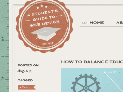
badge
blog
blog post
header
logo
navigation
stamp
tagged
texture
View all tags
Posted on Aug 25, 2011
19,810
38
305
31
View feedback
Janna Hagan ⚡️
Freelance email designer 🚀
Get in touch
More by Janna Hagan ⚡️
View profile
Previous
Next
Loading…
Loading…
Loading…