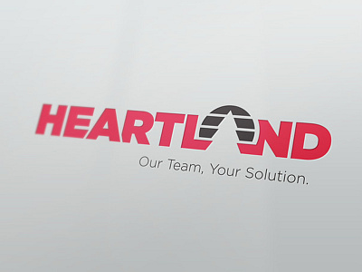
Heartland
This logo was completed during employment at Click Rain with creative direction from Mark Henderson. This logo was created with two things in mind: 1) Heartland is a family-owned company and should have some reflection of "home" and "warmth" to represent Heartland's commitment to service, and 2) The logo needs to be current to align with industry standards. The tree symbol placed where the "A" would be in "land" creates an abstract landscape that hints at Heartland's values, while the type and graphic elements use clean lines and geometric shapes to be "current".
More by Amy Gehling View profile
Like


