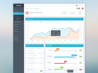
Dashboard Comparison Chart


Although I left Sparked several months ago, I still have few more designs I have yet to upload to this lovely community.
Granted, this design was created in Late 2014, but I'm sure it will be of inspiration to some. :)
Not to mention, my last post is over 8 months old! I will be uploading one more shot tomorrow, so stay tuned for that.
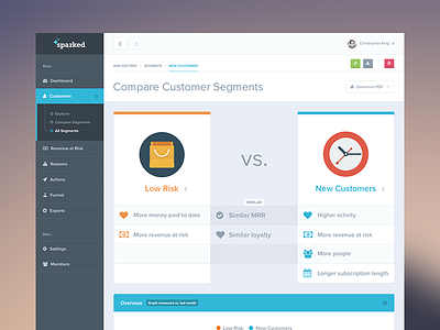
This is a Compare Customer Segments page, where the user can select different cohorts to see in plain sight, the similarities and the differences between one another.
Check attachment for full view.
Thanks~