Yeah you could be right. I didn't think too much about it beforehand. I think i wanted it to be more isolated from the rest than it ended up. Small and focused. It was just fun to break out the pen. :) I may play around more with it. You called me out on my doubt. :)
I'm late to this, but actually I think the size and placement of "CREATE" is spot on. The whitespace around it gives it the emphasis I believe you were trying to instill. I definitely felt the focus.
5 Responses
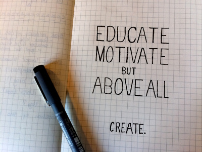
Tweeted about my dream job for an #nGenFriday contest and won! So I did up a quick sketch just because. :)
almost 2 years ago
Like! But for some reason I'm thinking "CREATE" should be bigger than the rest of the typography?
almost 2 years ago
Yeah you could be right. I didn't think too much about it beforehand. I think i wanted it to be more isolated from the rest than it ended up. Small and focused. It was just fun to break out the pen. :) I may play around more with it. You called me out on my doubt. :)
almost 2 years ago
Pro
Sean McCabe
I'm late to this, but actually I think the size and placement of "CREATE" is spot on. The whitespace around it gives it the emphasis I believe you were trying to instill. I definitely felt the focus.
over 1 year ago
Thanks Sean!
over 1 year ago