OkCupid Navigation Redesign


Last year (I know, it's taken a while to post it..) we redesigned the navigation on OkCupid. Beyond that, the main template that the site uses changed as well.
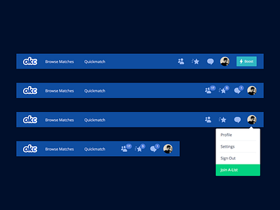
Before, the different navigation elements were broken up into a left sidebar, a right sidebar, and a few links at the top. We wanted to consolidate everything in one place at the top, and put some more thought into their organization. Links on the left, like Browse Matches and Quickmatch, are for discovering people. Links on the right are devoted to you and your interactions with others.
Another benefit of having a horizontal nav at the top is it frees up real estate below. The extra space has given us a chance to rethink the design of each page, and we've subsequently shipped a lot of projects that have benefitted from the new format.