Expense tracking overview

Hi guys,
welcome to my "here is another money app" series part 3.
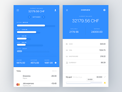
The one on left would be a "pulled down" category list when the user pulling the timeline downwards. The chart is a little bit tricky, long story short: you can track your spendings compare to the last month, which would motivate you to spend less but, the income works the opposite way, the's dark part show the most successful month and the white is the current month, this means that it's motivating you to earn more. Maybe an animation would be handy but I hope you got it. The table isn't balanced yet but working on it.
The right one is the overview where you can see the details of the accounts by tapping on the timeline's top part. Here you can track how much you can spend and how much you've saved already if you created a goal.
I simplified the typography a little bit so there are some changes since my last shot but I hope you like it.


