Two suggestions though: I'd try to refine the placements of the numbers. I love how you placed the #2, but #3 feels lost up there, why not place it also next to the text?
The other thing I noticed is that the horizontal arrows seem to have a subtle drop shadow to the top, to make it look inset, but the diagonal one doesn't...
@Miro Keller — You're totally right, the only problem is space though. The text that belongs with #3 is longer and therefore requires more space which makes it hard to place #3 next to it. I'll give it another shot though - it definitely makes it easier to read.
The diagonal line also have the same drop shadow, it's just not as visible. I'll try to pump up the opacity a bit :)
19 Responses
Pro
Ole Martin Kristiansen
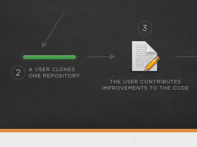
Work done earlier today. An attempt at explaining how Gitorious works in a simple manner through illustrations.
Page icon credits to PixelMixer!
over 1 year ago
Pro
Kristian Hjelle
Lovely shot!
Would finish the dark-grey-filling between the dashes to the left, otherwise this is looking slick as always. Good to see you dribbbling again :-)
over 1 year ago
Pure hotness!
over 1 year ago
Pro
Blake McDivitt
great texture on the black
over 1 year ago
Pro
Ole Martin Kristiansen
Thanks guys! Of course, I totally forgot to mention the texture credits, the always wonderful Liam Mckay!
over 1 year ago
Pro
Gedy Rivera
Sweet work Ole.
over 1 year ago
Pro
Morgan Allan Knutson
YES!
over 1 year ago
Pro
Daniel Sensecall
This looks great. Got to love those textures ;)
over 1 year ago
Pro
Jeff Siarto
Love the green and black. That texture is somewhere in between chalkboard and leather. Sweet.
over 1 year ago
Pro
Kyle Meyer
Love the texture.
Want to steal it. ;)
over 1 year ago
Pro
Miro Keller
Looking good!
Two suggestions though: I'd try to refine the placements of the numbers. I love how you placed the #2, but #3 feels lost up there, why not place it also next to the text?
The other thing I noticed is that the horizontal arrows seem to have a subtle drop shadow to the top, to make it look inset, but the diagonal one doesn't...
over 1 year ago
Pro
Patrik Larsson
Love the details! Great work :)
over 1 year ago
Pro
Dan Wiersema
Very nice!
over 1 year ago
Pro
Kyee
really good work!
over 1 year ago
Pro
Ole Martin Kristiansen
Thanks you all!
@Miro Keller — You're totally right, the only problem is space though. The text that belongs with #3 is longer and therefore requires more space which makes it hard to place #3 next to it. I'll give it another shot though - it definitely makes it easier to read.
The diagonal line also have the same drop shadow, it's just not as visible. I'll try to pump up the opacity a bit :)
over 1 year ago
Pro
Miro Keller
@Ole Yeah I thought that might be the case. Maybe you could separate the elements a bit so to gain more space...
over 1 year ago
Very nice. I like how the steps/content really pops off the dark texture.
over 1 year ago
Pro
Jarad Johnson
Love the subtle dotted line around the bar. Beautiful.
over 1 year ago
This is fantastic!!!
11 months ago