Multi-Purpose Dashboard Design

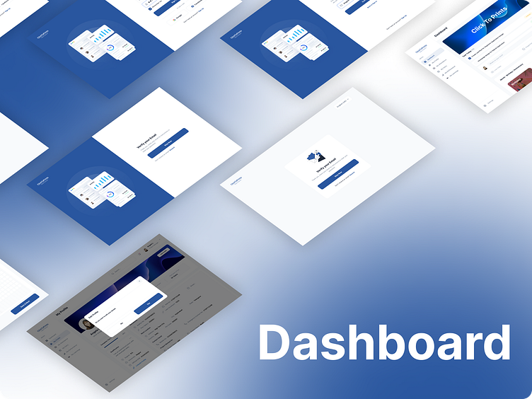
A multi-purpose dashboard is designed to cater to a variety of user needs across different functions and departments within an organization. The goal is to create a versatile and adaptable interface that provides comprehensive insights, supports decision-making, and enhances user engagement. Here’s a detailed description of the design process for a multi-purpose dashboard using Figma:
Purpose and Audience
The multi-purpose dashboard is intended for a broad audience, including business analysts, managers, executives, and operational staff. It aims to consolidate diverse data sources and present them in a unified, easy-to-understand format. The dashboard should be flexible enough to display different types of information, from high-level overviews to detailed analytics.
Layout and Structure
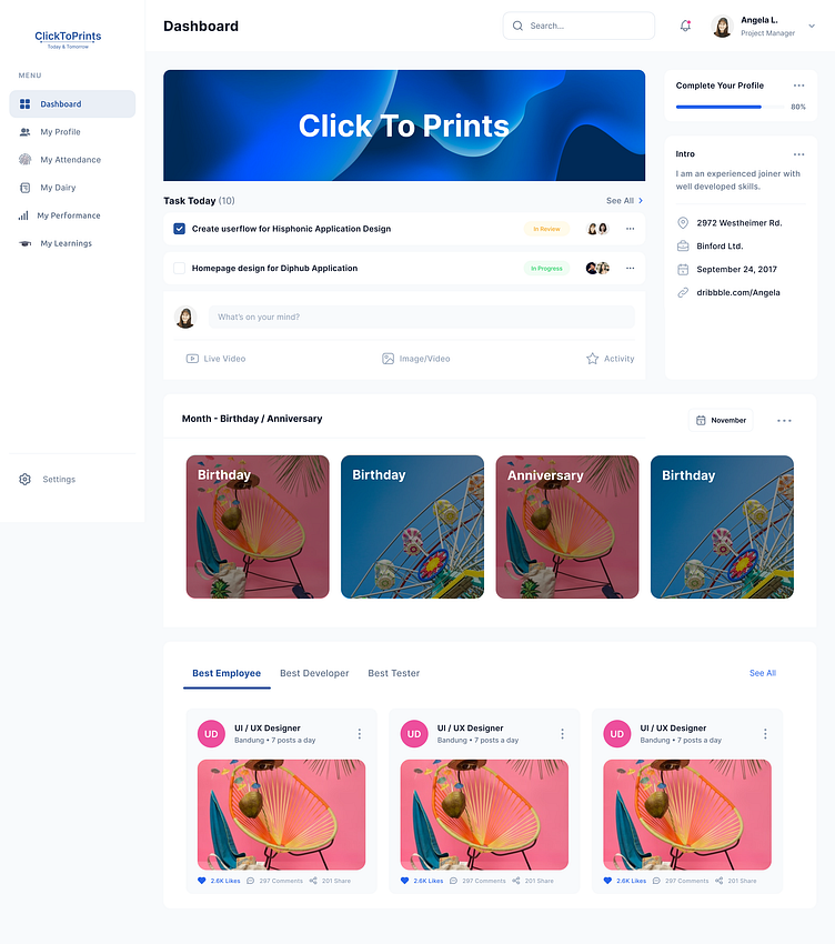
The layout of the multi-purpose dashboard is designed to be modular and customizable, allowing users to tailor the interface to their specific needs. Key components of the layout include:
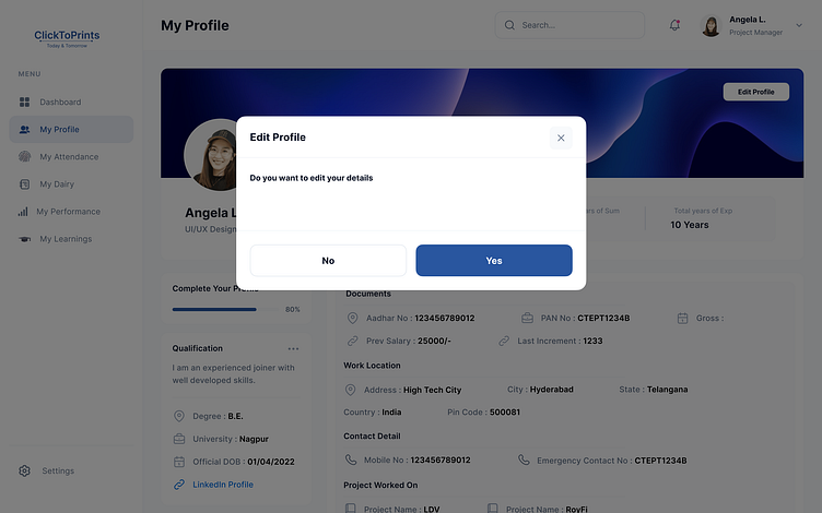
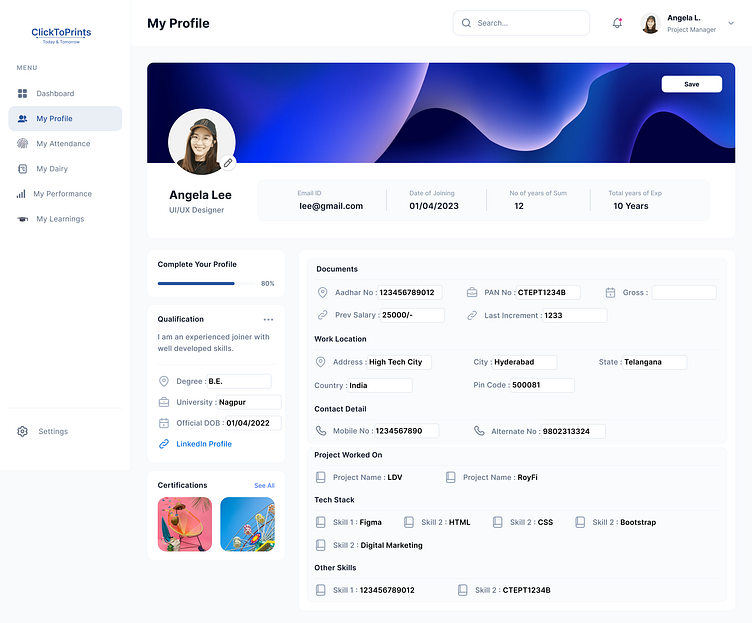
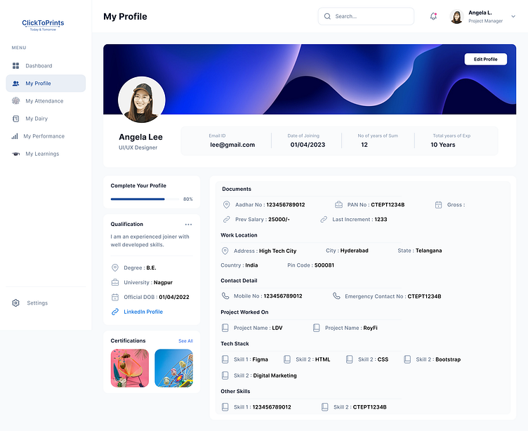
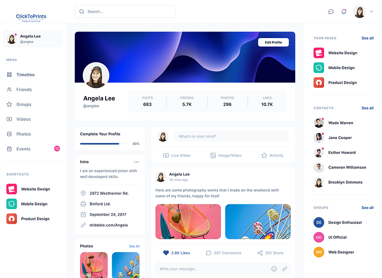
Header: This area contains the dashboard title, user profile, notification icons, and a global search bar. It may also include quick access to settings and user preferences.
Side Navigation Panel: A collapsible sidebar that provides access to various modules and sections of the dashboard, such as sales, marketing, finance, and operations.
Main Content Area: The central workspace where primary data visualizations and widgets are displayed. This area is highly configurable, allowing users to drag-and-drop widgets, resize components, and customize their layout.
Footer: Optional section for additional navigation links, help resources, and contact information.
Color Scheme and Typography
The color scheme and typography are chosen to ensure readability, create a professional look, and align with the organization's branding. The design employs a balanced color palette with primary and secondary colors used to differentiate various data elements.
Primary Colors: Used for headers, key metrics, and action buttons.
Secondary Colors: Used for background elements, secondary text, and less critical data.
Typography: Clear and legible fonts are used with a well-defined hierarchy:
Headings: Bold and larger size to highlight key sections.
Subheadings: Slightly smaller and less bold for secondary headings.
Body Text: Regular weight for general information.
Data Labels: Smaller size, yet clear for readability.
Components and Elements
The dashboard includes several reusable components designed for versatility and consistency:
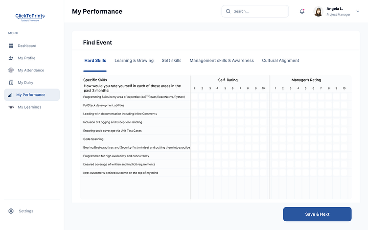
Widgets and Cards: Modular elements displaying individual metrics or KPIs. Each card includes a title, main data point, and visual aids like small charts or trend indicators.
Charts and Graphs: Visual representations of data, including bar charts, line graphs, pie charts, and area charts. Interactive features like tooltips and zooming enhance data exploration.
Tables: For detailed data representation, featuring sortable columns and filter options.
Interactive Elements: Buttons, dropdowns, sliders, and toggles for filtering data and adjusting views.
Interactivity and Prototyping
To ensure a dynamic user experience, the dashboard design incorporates interactive elements. Using Figma’s prototyping features, interactions such as hover effects, clicks, and transitions between different dashboard views are simulated. This helps validate the design and gather user feedback prior to development.
Accessibility and Responsiveness
The dashboard is designed with accessibility and responsiveness in mind:
Color Contrast: Ensuring sufficient contrast between text and background.
Font Size: Using readable font sizes and allowing users to adjust text size.
Keyboard Navigation: Making sure all interactive elements are accessible via keyboard.
Screen Reader Compatibility: Providing descriptive alt text for images and proper labels for interactive elements.
Responsive Design: Ensuring the dashboard works well on various devices, including desktops, tablets, and smartphones.
Collaboration and Feedback
The design process involves continuous collaboration with stakeholders and team members. Figma’s sharing and commenting features facilitate real-time feedback and iterative improvements, ensuring the final design meets user needs and business goals.
Handoff to Development
Once the design is finalized, detailed specifications are prepared for the development team:
Design Specifications: Including color codes, typography details, spacing, and dimensions.
Exported Assets: Icons, images, and other graphical elements.
Component Libraries: Organized libraries of reusable components and styles for consistency in development.
Key Features
Customizable Layout: Users can personalize their dashboard layout by adding, removing, and rearranging widgets.
Real-Time Data: Integrates with various data sources to provide up-to-date information.
Multi-User Support: Accommodates different user roles and permissions.
Interactive Visualizations: Enhances data exploration with interactive charts and graphs.
Responsive Design: Ensures optimal viewing experience across all devices.
By following this structured approach, the multi-purpose dashboard design in Figma aims to deliver a functional, visually appealing, and user-friendly interface that effectively meets diverse user needs and facilitates better decision-making.