Dashboard design

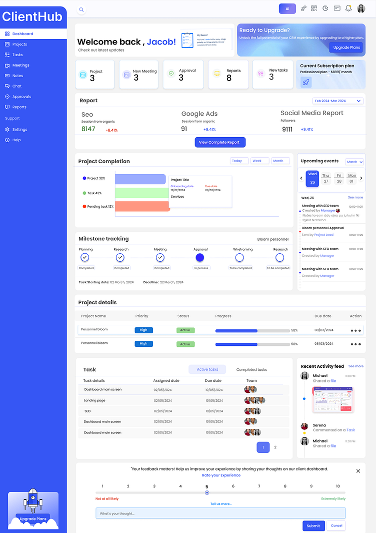
The design likely started with a deep understanding of the users' needs, behaviors, and pain points. The dashboard's layout and organization are crucial for easy navigation and information retrieval.
It has a clear visual hierarchy which helps users quickly grasp the most important information, it includes using size, color, contrast, and typography to highlight key data points, actions, or insights.


