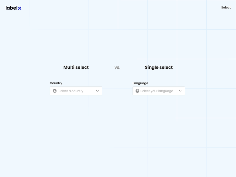
Multi-Select and Single-Select Components

Effective selection component design goes beyond functionality; it's about creating a distinctive user experience that clearly conveys the component's purpose. Multi-select and single-select components serve different use cases, and their design should reflect this.
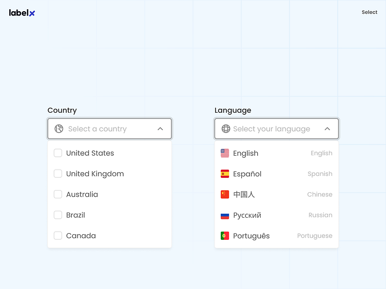
✨ For multi-select components, emphasize the ability to choose multiple items by displaying selected options as tags or chips within the input field. This visual representation allows users to review and modify their choices easily.
✨ In contrast, single-select components should focus on simplicity and clarity, with the selected option prominently displayed as plain text within the input field.
✨ Incorporate other design elements, such as color or iconography, to highlight selected tags in multi-select components and use hover states or subtle animations to provide visual feedback for single-select components.
👉 Explore more tips for designing exceptional components and how thoughtful design choices can elevate your user experience on my social platforms.
LabelX's robust design system is launching soon!
👉 Sign up for early bird access https://labelx.design/