Find designers
Designer search
Quickly find your next designer
Post a job
The #1 job board for design talent
Inspiration
Courses
UX Diploma
Learn UX design from scratch in 6 months
UI Certificate
12-week UI skill building for designers
Live interactive workshops
with design professionals
Jobs
Go Pro
Log in
Dribbble: the community for graphic design
Advance your career with a Professional Diploma in UX Design
Learn more
Log in
Sign up
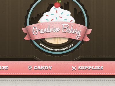
Grandview Bakery
Eric Atha
Follow
Following
Like
#332B20
#EA9C99
#E3DDDA
#4F4330
#B37B77
#BBB9B0
#645D56
Download color palette
Header for an upcoming Bakery website.
Also, thanks to Jay Fanelli for the invite!
bakery
menu
navigation
pink
pittsburgh
ribbon
thread
View all tags
Posted on Aug 19, 2011
8,967
29
232
19
View feedback
Eric Atha
More by Eric Atha
View profile
Previous
Next
Loading…