SWEET!! janna... this looks amazing so far. #jealous/excited! I wonder if the margin or padding on the text of the Tagged links i.e. portfolio would be hard to read, if it's smaller than what it's showing.. make sense?
This looks fantastic! Really slick. The only thing I'm not fond of is the flat wide text as body text. I think it can work as a header font but the main text should be less short and weight and more standard.
Really great work so far, I'm really excited to start following this blog.
I love the details on this, especially the rule along the side! Something about the tags gets me... maybe a bit more line-height for the text in them? This might "fix itself" if you find a new font. Great stuff!
16 Responses
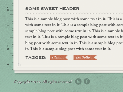
Taking a different direction with this.
We now have a Facebook page, like us!
almost 2 years ago
Love your style! :)
almost 2 years ago
Pro
Nick Jarvis
SWEET!! janna... this looks amazing so far. #jealous/excited! I wonder if the margin or padding on the text of the Tagged links i.e. portfolio would be hard to read, if it's smaller than what it's showing.. make sense?
almost 2 years ago
This looks fantastic! Really slick. The only thing I'm not fond of is the flat wide text as body text. I think it can work as a header font but the main text should be less short and weight and more standard.
Really great work so far, I'm really excited to start following this blog.
almost 2 years ago
The text is smaller than what will be on the actual site :) Thanks Nick!
almost 2 years ago
Lovely! I'm with Collin, though: I like it, but reading that wide body copy will get tough on the eyes. Beautifully done, though. :)
almost 2 years ago
Thanks guys, I'm with you on the font as well. I'll look for something better :)
almost 2 years ago
Pro
Trav
Looks awesome :) I'm with the others on the type though.
almost 2 years ago
Pro
Iain MacDonald
Oh my! I'm loving this. Looking forward to see more. :D
almost 2 years ago
yay! nice layout and colors, Janna.
almost 2 years ago
I love the details on this, especially the rule along the side! Something about the tags gets me... maybe a bit more line-height for the text in them? This might "fix itself" if you find a new font. Great stuff!
almost 2 years ago
niceee
almost 2 years ago
Loving the tones, yo
almost 2 years ago
Pro
Forefathers™
LOVE this :D
almost 2 years ago
@Dom: That's not saying much lol! =P
almost 2 years ago
Pro
Stephen Di Donato
Surprised you didn't use picas (sarcasm). Oddly enough I was taught to use them.
almost 2 years ago