Preferred Weight Loss Brand Design, Logo and Business Card

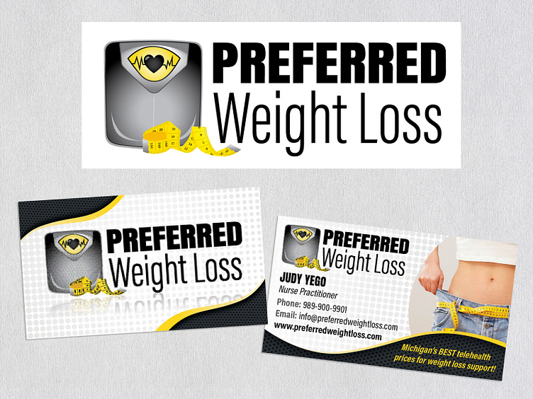
A nurse practitioner approached me with a vision to establish a weight loss venture. After reviewing her website, which featured a black-and-yellow theme with diverse weight loss imagery, inspiration struck for the logo design. Using Adobe Illustrator, I hand-drew the scale and measuring tape, aiming for a modern and sleek appearance, while integrating a heart to symbolize the compassionate care she provides to her patients. To ensure 'Preferred' stood out prominently, I selected a bold brick font, while opting for a clean, thin, and simple style for 'Weight Loss'. The business card was meticulously crafted using Adobe InDesign, while the black-and-white advertisement below was designed using Adobe Express.


