Eat Real Rebrand


The realest
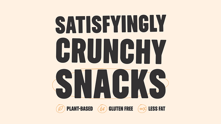
After the merging of PROPER and Eat Real under WARP Snacks, the team thought it was time to bring the branding of the cornershop favourite in line with PROPER’s high standard of design output. Under the new brand direction of ‘The Realest’, Eat Real’s new brand world heroes the everyday – referencing the aesthetics of their home in your local newsagents – everything from receipts to crates to price tags.


Don't forget the kids
Once the direction was set for Eat Real’s core range, we worked on expanding this look and feel into their kid’s snacks. A tomato mascot was created to grab the attention of children, whilst adopting the clean typography and reduced natural colour palette from the core range, to please their health-conscious parents.


