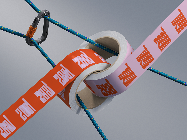
Zeal Packaging Tape

This is one aspect of the packaging design for Zeal skincare.
This design is meant to be a bold splash to infuse what's going to otherwise be a plain shipping box design. For the sake of recycle-ability, sustainability, and reuse-ability I try to steer clear of adding much (if any) inks to my shipping box designs. I know they do have biodegradable and plant-based inks and there are definitely times where I utilize those options, but for the most part I like to minimize impact as much as possible and shipping boxes feels like a pretty easy way to do that. Maybe it's also because I live in a city and am wary of splashy boxes because it draws the wrong kind of attention on a porch or in a mailroom, I don't know but I like to keep it simple. I love the idea of an inconspicuous box opening up to reveal a big bold brand splash, I think it's a great way to illustrate the world your brand creates-- like in old school cartoons where they'd find a super boring chest and open it up to reveal shining gold, jewels, and treasure.
That being said, I'm not oblivious to the fact that it is a marketing opportunity especially for predominantly direct-to-consumer brands, so I do like to play in to the intrigue and exploring how to do that without giving too much away or sacrificing sustainability, right now my favorite way is with tape design! I love it because you have to take it off to recycle the box regardless, it doesn't interfere with reusing, and it's much less manufacturing-intensive.
All this to say, I love designing unboxing experiences but prefer to keep the magic inside the box.


