Visual Identity of Jovenes Que Inspiran, Barcelona

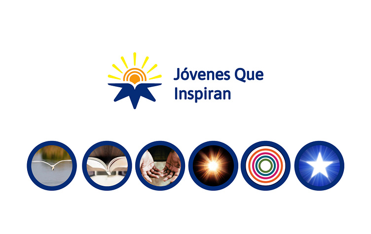
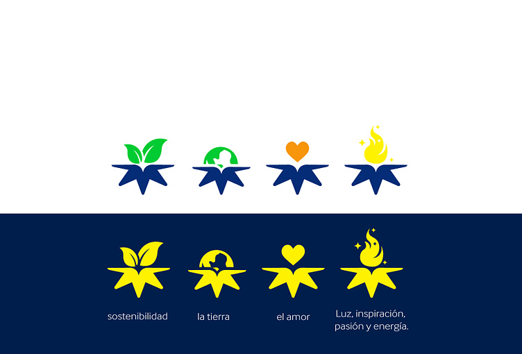
Jovenes que inspiran is an association in Barcelona, Spain that focuses on the emotional well being of the younger audience, they also focus on environmental stewardship.
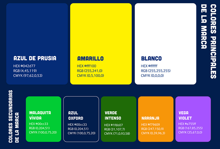
The logo was designed to reflect certain elements that resonates with the brand's identity
A star which signifies being the best and standing out because one of the purpose of this project is to also help the young people have success in their personal and professional lives too
A bird flying which means success and soaring above obstacles
The sun which of course signifies light, bringing light into the heart and mind of anyone that would benefit from the projects
The circle in the logo signifies a community
An open book noticed in the star-like element signifies education and knowledge the programs will also focus on educating the young ones on a lot of things including but not limited to managing their emotions, understanding their environment, creating healthy connections etc
The conceptual hands in the logo depicts readiness to give back and having an open hand can also be likened to generousity
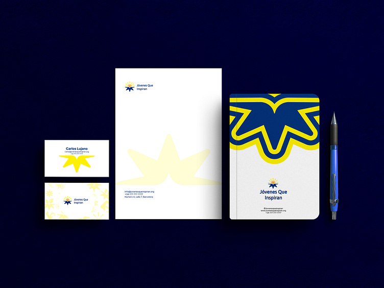
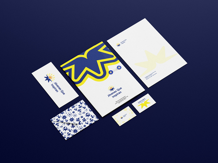
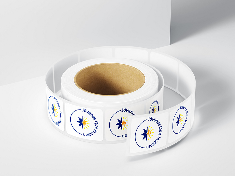
Stationery designs


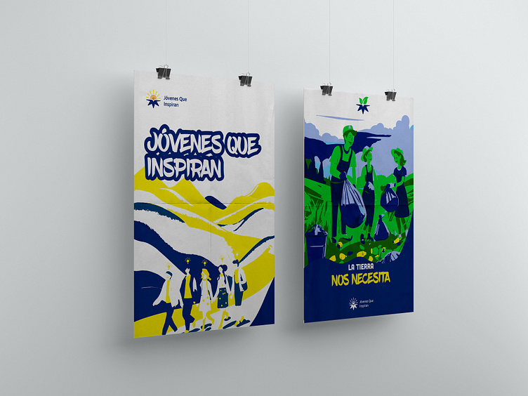
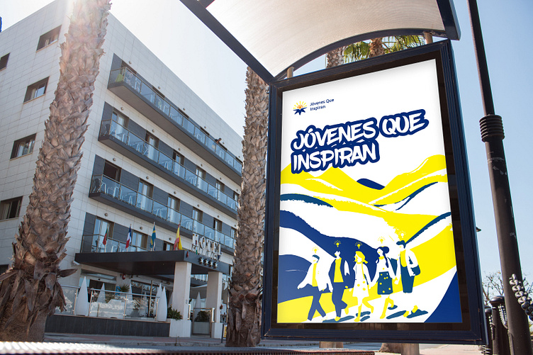
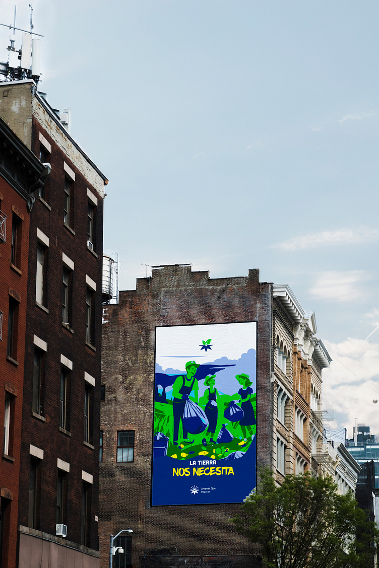
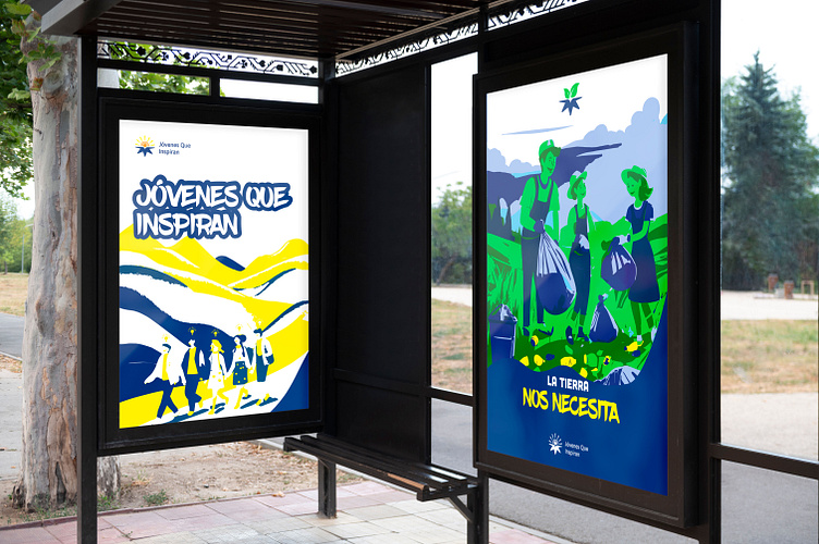
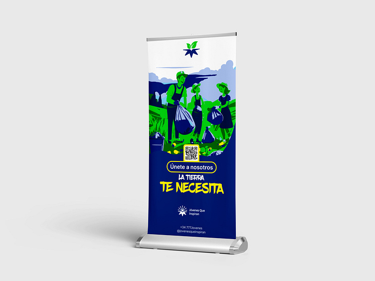
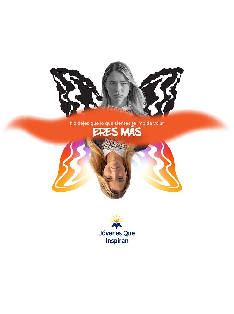
Poster and banner designs

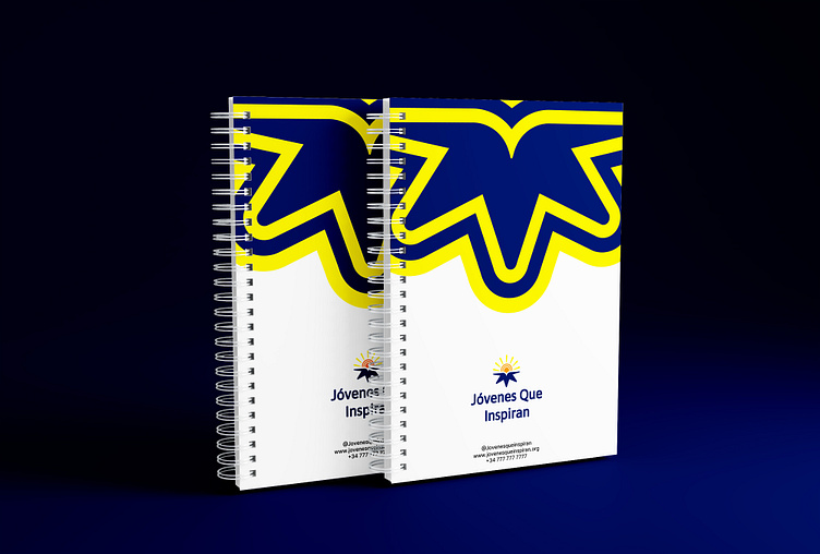
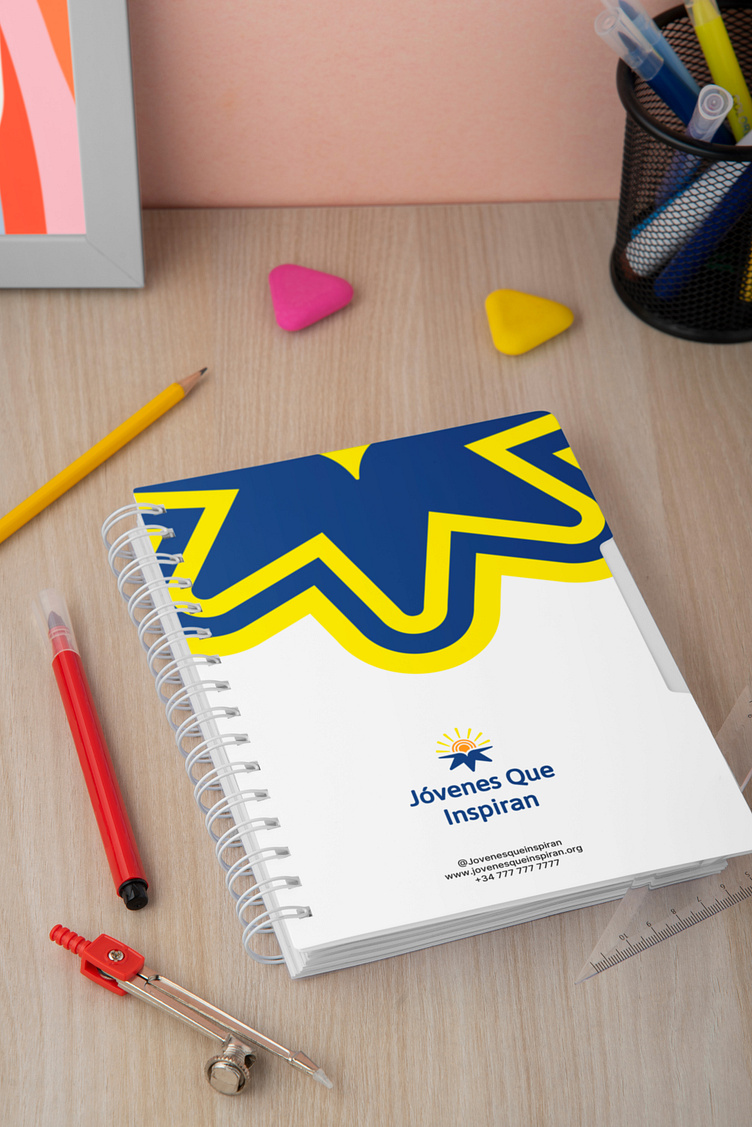
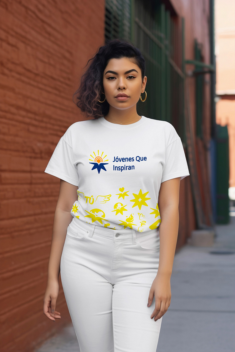
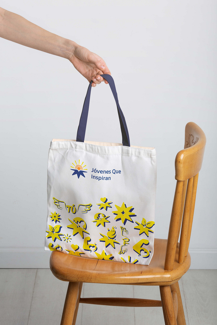
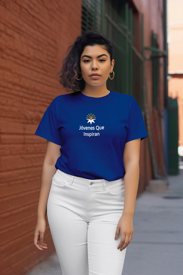
Merchandise designs


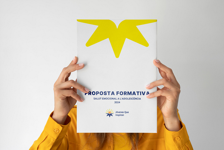
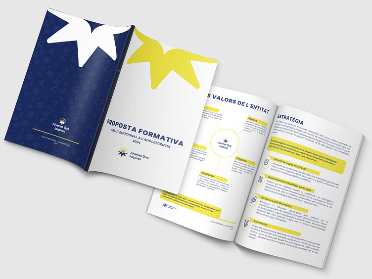
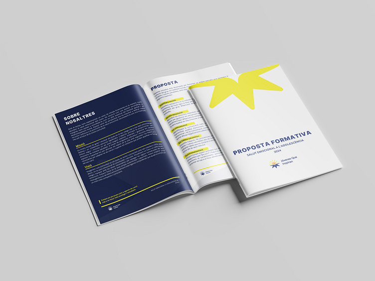
Brochure design

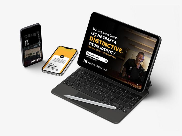
Designed by Victor Elera (Elera Design Studio)
Thank you for viewing
If you need a visual identity design or any other design service you can reach out to me by clicking here