Hybrid Digital

This is Hybrid Digital 2.0
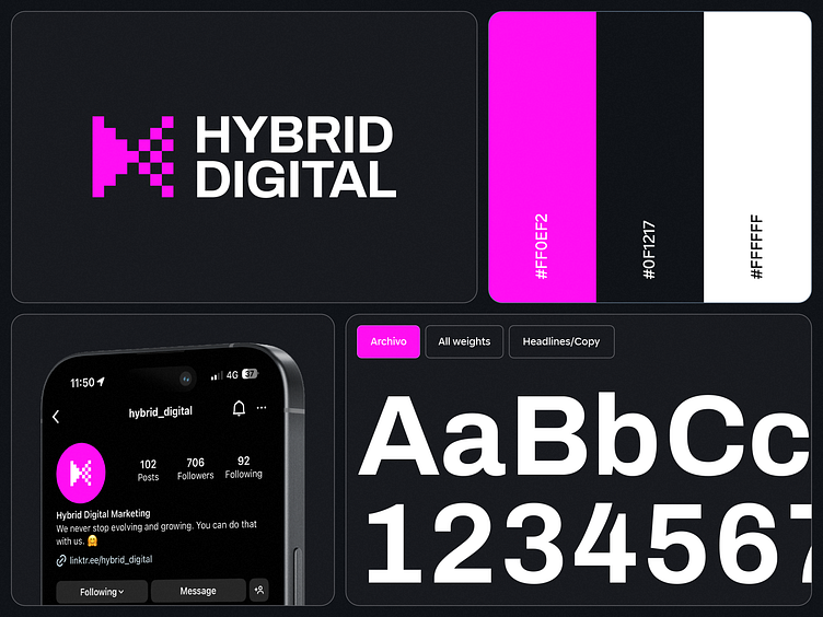
Pixels are like the heart and soul of digital – a bit old-school, yet super versatile for some edgy marketing down the road. We went all in, turning our bow into a pixel party. Those merging triangles? They’re all about our style – a mishmash of wild ideas and spot-on deliverables.
We wanted to tone down the color splash a bit. Our old vibe was all about two colors blending into our Hybrid Digital bow. The challenge this time? Crafting that bow with just one color. What we landed on was a pixelated icon, lighter on the right, in order to nail the distinction that used to come from color play. It’s sleek, it’s modern, and we really like it.
But it’s not just about fewer colors. Our modern twist shines through in everything – from the streamlined icon to the fresh typography.
New logo philosophy:
- We kept the recognisable triangles merging - symbolizing “hybrid” - Created out of pixels to symbolise “ everything digital”
- Less color on the logo itself (we managed to keep the message of the old logo by creating a pixelated icon with the second part of the logo having less pixels to make a clear difference between the two triangles which the old logo did with colors.)
- More modern look and feel through icon and typography
- Visible at any scale- Natural evolution of the old logo
- New logo works better in negative, black and white
- Simplified brand color palette


