Find designers
Designer search
Quickly find your next designer
Post a job
The #1 job board for design talent
Inspiration
Courses
UX Diploma
Learn UX design from scratch in 6 months
UI Certificate
12-week UI skill building for designers
Live interactive workshops
with design professionals
Jobs
Go Pro
Log in
Dribbble: the community for graphic design
Log in
Sign up
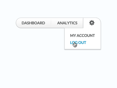
Customizer Dashboard Menu
Vin Thomas
Available for work
Follow
Following
Like
Get in touch
#FAFCFE
#9FA0A0
#5F6161
#96CEE2
#1D97C4
#1A1A1A
Download color palette
Menu for the Customizer app dashboard redesign.
dropdown
hover
icon
menu
nav
navigation
shadow
View all tags
Posted on Aug 18, 2011
3,985
17
67
6
View feedback
Vin Thomas
Helping B2B Tech Brands Succeed Online.
Get in touch
More by Vin Thomas
View profile
Previous
Next
Loading…
Loading…
Loading…