No-nie's Granola Product Design


Roles
Product Designer, Graphic Designer
Tools
Adobe Photoshop, Adobe Illustrator, Adobe Indesign
Introduction
No-nie's is a no waste, no nut granola line that strives to produce a allergin free granola without any of the harmful packaging that negatively impacts the environment. Clean, efficient and reusable, the granola jar is an earth friendly, human sensitive product that brings healthy and holistic granola to customers.

Design Process
User Desires
A text logo that is clean and minimalistic
Labeling suitable for jars
Overall calm aesthetic with a pop of movement
Simple advertising with the product as the main focus and minimal text
Execution
Three label variations of different colors to indicate different flavors of granola
Abstract/organic line work to provide visual intrigue
A simple, thin text based logo with an accompanying tagline
Transparent space in the label where granola can be seen
Room for a nutrition label
Creative advertising with tag lines of minimal text
As I was creating the labeling for No'nie's, I decided to base the majority of the design around the logo and tag lines, as they transmitted the majority of the meaning behind the brand. I separated the "no" to echo the concept of "no nuts" and "no bars," which also made the text stackable, allowing the logo to become more dynamic despite an otherwise plain look.
The abstract linework I drew is perfect for the packaging concept, as it doesn't overwhelm the label but has a heaviness that balances out the lightweight of the logo. The organic shapes also yield to the more curvilinear nature of the text, providing a sense of theme. Both the text and imagery are clean and simple, promoting the essence of No-nie's holistic and no nonsense product.
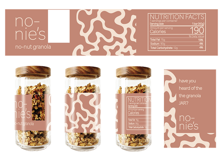
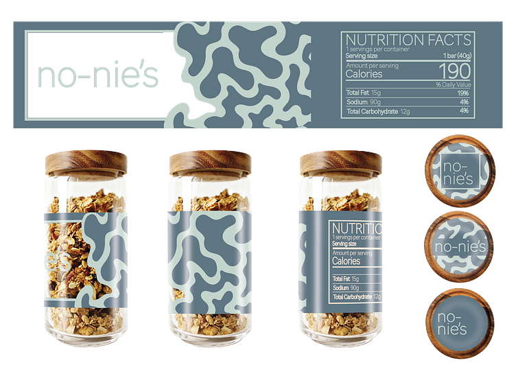
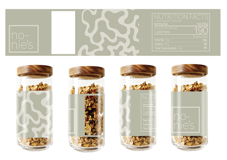
I explored three variations of the label, one with the logo large on a opaque background, one with the logo on the transparent portion of the label, and a final option where the logo was condensed to a frame. Each provides a mildly different feel to the product, but all could be used as packaging variations to differentiate different flavors of granola.
Below: three variations of No-nie's product packaging
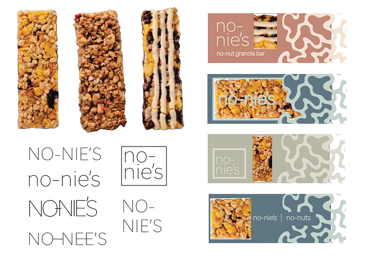
Below: More experimentation of different label arrangements, along with various logo styles and granolas.

This project was completed on a much smaller picture plane than what I am used to working with, and designing for such tiny dimensions was a good excercise in prioritizing only what was necessary. I really love how the advertising elements turned out and would enjoy expanding that portion of the project to include a wider variety of similar ads. If I did this project again, I would explore incorporating more kinds of graphic imagery and would be interested to test new ways of incorporating the nutrition label into the design.


